Originally published on the CURTIS Digital, Inc. blog.
Agile Burndown Charts and Why You Need Them
If you search for “Burndown chart example” on Google images, as we software folk are wont to do, you’ll stumble across this little gem:
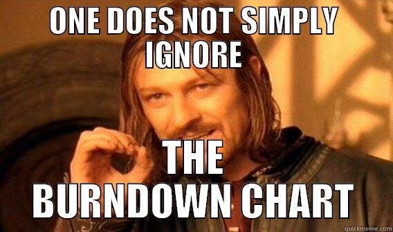
Whether or not you have a deeply rooted appreciation for internet memes, there is no denying the fact that Boromir/Sean Bean/Ned Stark is right. One does not simply ignore the burndown chart. If you’re new to Agile development or simply have not used burndown charts in the past, you might be wondering what insight they might bring you. Speak friend and enter (see what we did there?), and we’ll tell you.
According to the website Agile In a Nutshell, the burndown chart is a tool that “shows how quickly you and your team are burning through your customer’s user stories.” Reviewing your burndown chart can tell you how much work you’ve completed in your sprint, how much work is remaining, and when your team can expect to complete the remaining tasks.
Here is an example of a burndown chart from JIRA, the tool that we use for sprint management:

As you can see, the Y-axis is represents your tracking statistic (here, they use story points. We use hours.) and the X-axis is representative of time. In an ideal burndown chart, the red line (remaining values) tracks closely against the grey line (ideal remaining values). This is not the case here, although the hypothetical team above seems to have completed most of the story points that they committed to at the beginning of the sprint. You can tell this by looking at where the red line intersects the Y-axis on the right side of the chart — around 2 or 3 story points remaining, which appears pretty good at first glance. The key word here is “appears,” although a cursory inspection will reveal that this is likely not the case.
If this was your teams’ chart and you had minimal experience reviewing burndown charts, chances are that you might forgo reviewing it. They completed almost all of their tasks, right? Why waste the time? In this example, such a decision is to the entire teams’ detriment. Let’s look at this chart in a little more depth. The team is over their original estimate from day one. To the untrained eye, it can look like they made up for lost time around May 17th and 18th. However, longtime practitioners of Agile will tell you that sharp decreases suggest that the team dropped scope to help get themselves back in line towards the end of the sprint, not that they magically completed several story points worth of work. These decreases beg the question– what happened? Where did this team go wrong in their estimation process? Why did they decide to drop scope so late in the sprint? How can we prevent the same issues from happening again? Questions of this nature require answers in order for the team to better themselves, and they are excellent talking points for Sprint Retrospective meetings.
Burndown charts make the reality of your project clear. Assuming that your team knows how to accurately track their time, these charts do not lie. For example, if a team was reviewing the chart above daily, they would know almost immediately that something would need to change or they would not complete the tasks that the committed to.This type of knowledge is a huge benefit of Agile because it gives the entire team the time they need to correct themselves. True, the chances of them actually catching up and completing all of the tasks in this sprint are unlikely. However, the burndown chart highlights concrete examples of what went wrong and where, with the goal that once these issues are discussed the team will know how to prevent them in the upcoming sprint.
Originally published on the CURTIS Digital, Inc. blog.
Agile Burndown Charts and Why You Need Them
If you search for “Burndown chart example” on Google images, as we software folk are wont to do, you’ll stumble across this little gem:
Whether or not you have a deeply rooted appreciation for internet memes, there is no denying the fact that Boromir/Sean Bean/Ned Stark is right. One does not simply ignore the burndown chart. If you’re new to Agile development or simply have not used burndown charts in the past, you might be wondering what insight they might bring you. Speak friend and enter (see what we did there?), and we’ll tell you.
According to the website Agile In a Nutshell, the burndown chart is a tool that “shows how quickly you and your team are burning through your customer’s user stories.” Reviewing your burndown chart can tell you how much work you’ve completed in your sprint, how much work is remaining, and when your team can expect to complete the remaining tasks.
Here is an example of a burndown chart from JIRA, the tool that we use for sprint management:
As you can see, the Y-axis is represents your tracking statistic (here, they use story points. We use hours.) and the X-axis is representative of time. In an ideal burndown chart, the red line (remaining values) tracks closely against the grey line (ideal remaining values). This is not the case here, although the hypothetical team above seems to have completed most of the story points that they committed to at the beginning of the sprint. You can tell this by looking at where the red line intersects the Y-axis on the right side of the chart — around 2 or 3 story points remaining, which appears pretty good at first glance. The key word here is “appears,” although a cursory inspection will reveal that this is likely not the case.
If this was your teams’ chart and you had minimal experience reviewing burndown charts, chances are that you might forgo reviewing it. They completed almost all of their tasks, right? Why waste the time? In this example, such a decision is to the entire teams’ detriment. Let’s look at this chart in a little more depth. The team is over their original estimate from day one. To the untrained eye, it can look like they made up for lost time around May 17th and 18th. However, longtime practitioners of Agile will tell you that sharp decreases suggest that the team dropped scope to help get themselves back in line towards the end of the sprint, not that they magically completed several story points worth of work. These decreases beg the question– what happened? Where did this team go wrong in their estimation process? Why did they decide to drop scope so late in the sprint? How can we prevent the same issues from happening again? Questions of this nature require answers in order for the team to better themselves, and they are excellent talking points for Sprint Retrospective meetings.
Burndown charts make the reality of your project clear. Assuming that your team knows how to accurately track their time, these charts do not lie. For example, if a team was reviewing the chart above daily, they would know almost immediately that something would need to change or they would not complete the tasks that the committed to.This type of knowledge is a huge benefit of Agile because it gives the entire team the time they need to correct themselves. True, the chances of them actually catching up and completing all of the tasks in this sprint are unlikely. However, the burndown chart highlights concrete examples of what went wrong and where, with the goal that once these issues are discussed the team will know how to prevent them in the upcoming sprint.